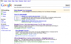
 Change is constant, and change is the only thing that makes people from around the globe, to be connected via the world wide web and keep them glued to their screens. Google , last week upgraded its view from a classical one to modern.
And, as we all know, the most common homepage is Google’s, so any change to that, will catch attention.The new rolled out model, has three columns, if you search for any option, you get a result page, which is what I think similar to Bing.
There is a middle column consisting of the results, there is a right column consisting of the ads, and the left column for the advanced search options. The newer interface allows us to get multiple results at once, without going for the advanced options in the top left options row in the classical model. Simply put, the new Google layout is good, user friendly.
In the Google forum, there are ,variety of people complaining of the design and want the old one back in. But Google is not going to listen to them, The google spokesman Nate Tyler confirmed by stating : “We’re not offering a way to revert back to the old design.” That is expected, Google has had changes in the past, and there come a bunch of people who hate the change in the first place and then going on to be liking it. People can use the search preferences page to control number of results shown, popping-open search listings in their own windows, enabling subscribed links and other options. For people who desperately want the old design back, they can bookmark this site.
The move to a permanently three-column design sees Google following in the footsteps of Ask.com, which pioneered the look back in 2007. Bing and Yahoo followed the three pane trend in 2009, and now it has effectively been given the stamp of approval by search giant Google itself.


Yes… Google's new Look has lots of good features… But it sucks in some features…
They forget to add the result position numbering in the new look. and the result for the any new keywords differs for every new search. Visitors will get frustration for this… 🙁
Hope they will fix these issues… 🙂
Yes… Google's new Look has lots of good features… But it sucks in some features…
They forget to add the result position numbering in the new look. and the result for the any new keywords differs for every new search. Visitors will get frustration for this… 🙁
Hope they will fix these issues… 🙂